Tufte CSS
Vanity has caught me again. Inspired by Dave Liepmann's Tufte
CSS, a hommage to Edward
Tufte's work on data visualisation
and his effort to translate it to the Web, I have mostly tried to integrate
those nifty sidenotesWebsites usually have more freedom in the horizontal space, and
the concept of a footnote
or a bottom of page
really has no
meaning here. Also they look cool, don't they? into my blog, but also
wanted to solve the issue of text lines generally being too long, while other
content (code, graphics) was generally too narrow. And since this required some
tinkering in the CSS, I considered my days off from work over this prolonged
weekend as a perfect opportunity to spice up my blog's design with this small
change.
And indeed, getting the sidenotes into the blog turned out to be rather easy. But to keep things consistent, I considered it a necessity to apply this main–side area separation to all the parts of this website. Which of course meant I had to tinker around a little more in the Python CGI codebase.
Oh boy.
In 2015, I might have been proud about what I had done.
But looking at that code today meant an unsettling amount of head-shaking and
fist-rising, occasionally accompanied by a whispered "What the hell". The code
had been split up, yet I failed to see any kind of logic of how it was done
so. It seemed to me like I had simply split code away from a file once it had
crossed some magical too many lines
limit. Or something, I don't really
know—there was a single 116-lines long script called scaffold.py that
handled the HTTP request parsing and the overall HTML document structure
build-up + HTTP response generation (latter in a very ugly way). I could
recognise a half-hearted attempt to split the view generation from the
logic, which unfortunately got somehow swallowed up by later code extensions
for previously unforeseen features. Starting to fix something at one place
caused a string of bugs to pop up at a completely different place, and the
small change
subsequently ate up my entire weekend.
Although—honestly—I can't say that it was completely devoid of fun. I mean, it's vanity tinkeringThe kind of tinkering that only affects parts of your IT infrastructure that revolve around your appearance to the outside world—after all, we're talking about a personal website., after all. And the result is pretty neat, I think:
-
The main content now takes 60% of the entire
<article>width to the left, while the sidenote area takes 36% of the width to the right. The sidenotes are simply<small>elements, styled with CSS to float to the right. To be honest, it isn't terribly comfortable writing the markup for that in a blog article, but then again, it's probably fine this way, as I would otherwise abuse them. -
The main page directly leads to the blog view. There is no point in showing a visitor an almost empty page with three links—that's just pseudo-
artistic
. -
The gallery's CSS has been fixed to scale the image such that it uses the entire available screen space (similar to CSS's
background-size: coverproperty—except that it's not a background). -
The principal font has been changed to the more elegant and open Linux Libertine, with Georgia as a fallback font.
Looking at the diff of the commit that introduced the change, it feels like git
futilely tried to make sense of the mess, only to resort to follow my
exampleYou know, the
head-shaking, fist-rising and curse-whispering.: In the cgi directory,
the diff (with roughly 360 lines removed and 450 lines added) shows 9 unchanged
non-whitespace lines, of which all are keywords like try: or else:, or
import os.
showing off
I consider text lines at around 35 ems to be the most
comfortable to read, while code should at least have a width of 80 characters.
By the way, this is a sidethought, i.e. a sidenote without a specific numbered
anchor in the text. Cool, eh? As noted above, the goal of this layout is
also to solve the old issue of text lines generally being too long, while other
elements like code blocks tend to become pretty useless if jammed into too
little space. This can now easily be achieved by assigning the fullwidth
class to any element in an article, and it will take up the entire 100% of the
width. This is often useful for showing a graphics that requires a high enough
resolution, or just for showing an image with added emphasis, like the photo of
this lovely cat:

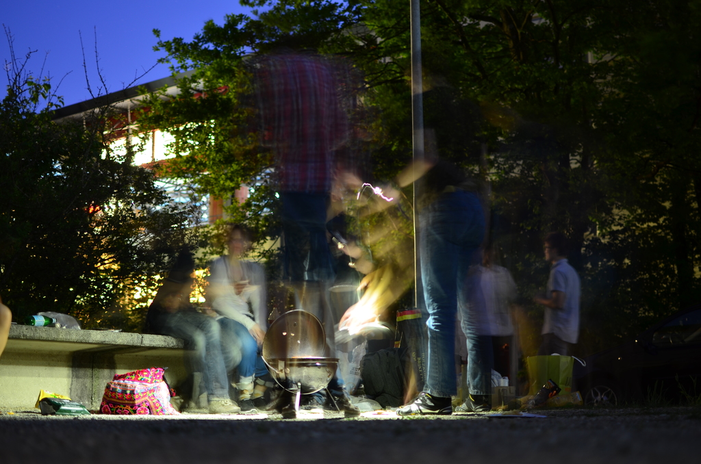
Of course it is not mandatory to display a picture in full-width—
displaying a regular
picture accompanied with a caption text to the side
is now possible, too:
 Shot from one
of our barbecue evenings at the EPFL (model: Nikon D5100, focal
length: 35mm, exposure: 15s, aperture: f1.8, flash: no, ISO: 100)
Another element that is best viewed in full width is a <pre> code block (note
that this is a diversion from Tufte CSS, where code is kept within the
boundary of normal text—I just thought that this doesn't make any sense);
as an example, the CSS part that allowed me to properly center and zoom the
picture in this website's gallery view:
article {
    width: 100%;
    height: calc(100% - 2.9rem); /* gallery navigation takes 2.9 rems */
}
article a {
    cursor: -webkit-zoom-in;
    cursor: zoom-in;
    display: block;
    position: relative;
    height: 100%;
    width: 100%;
    overflow: hidden;
}
article a img {
    /* http://stackoverflow.com/a/19414020/3673974 */
    position: absolute;
    top: -100%;
    bottom: -100%;
    left: -100%;
    right: -100%;
    margin: auto;
    min-height: 100%;
    min-width: 100%;
}
Lastly (and obviously) I learned a few things about the spacing around
em-dashes (there is none), the proper use of markup tags introduced with HTML 5
(<article>, <header>, etc.), or just how to properly organise my code such
that it doesn't end up as this pile of mess I had encountered on Friday evening.
And to explain my absence over the past 14 months: I had initially intended to write an article about how to set up an ALIX 2d3 with Debian for using as a home network router (similar to my QEMU/network/nftables guides), but the thing grew and grew and was never really finished, yet it did a remarkably good job at keeping me from writing any other new articles"If you work on a blog article, you might as well work on me!", until I concluded that the information might be better kept in my private little wiki that I have started to build up recently.
But that's for a different story.
As for the future: I have noticed that I prefer writing code over writing about code, so perhaps the focus of my blog will lie a little more on non-technical stuff (like politics—the world currently is quite a mess, honestly), or the more high-level, organisational aspects of technology (like "When will applications stop littering my home directory with dotfiles and adhere to the XDG base directory specifications?")—I have no idea how it will work out, but we'll (hopefully) see in the next few weeks.